Selection
Selection variables allow you to provide lists of values for the user to make their choice from there. They can select one value or multiple values depending on how you set up the variable. There are three property settings that allow you to further manipulate the design and user experience.
Select From
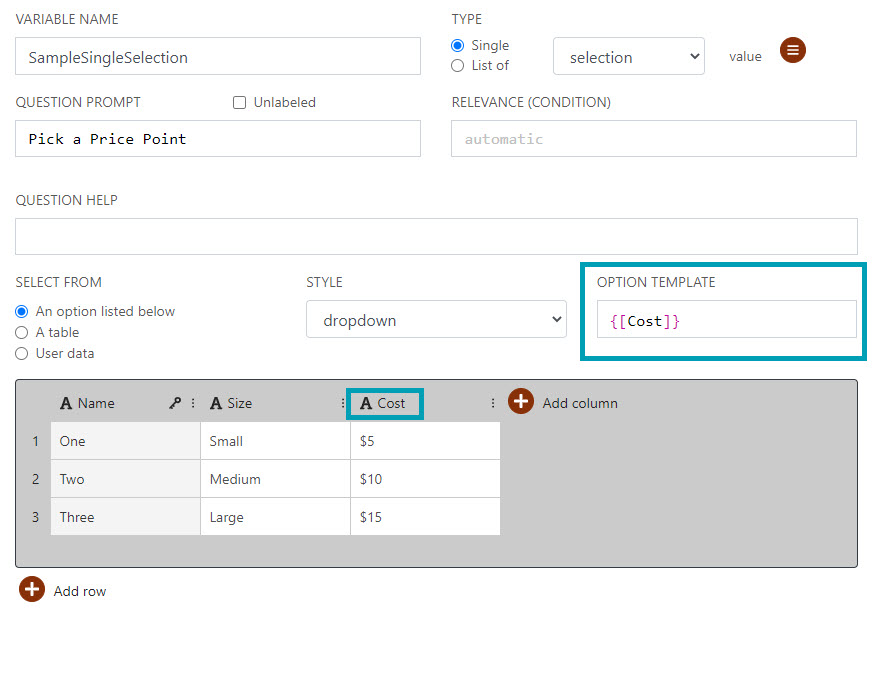
This is where you input the values your users will see. Your choices in setting up the variable are An option listed below, A table or User data.
If you choose An option listed below, a table will appear at the bottom of the variable designer. You then add the appropriate values to that one time use table. You can type the value in row one and push Enter to create the next row and so on. If you want to add a column, click on the plus sign for Add column and Name that column. You might use this if you want the user to see one thing and the output to be something else: e.g. user selects “male” and the output is “Mr.” (You will learn more about that in later courses.) To delete a column, click on the column menu and select Delete. Each row gives the user another option to choose from, but if you create an unnecessary row, you can delete it by clicking on the row number and selecting Delete. Bonus value, if you have information in another document as a list or in a spreadsheet, you can copy and paste the list into the table after you have all the necessary empty columns added.
If you choose to select from A Table, you will need to choose an Option Source. The Option Source drop-down menu is a list of all the table models you have previously created under Elements. These work similar to the table you create for An option listed below but the added value is that you can reuse them in multiple places and maintain the data in one place.
User data is the final option that allows you to select a resource that is providing values based on the user entering the information and Knackly then dynamically capturing these values. You can learn about this in a more advanced lesson here.


Style
The Style you select shows up in the user interface. You might choose a dropdown style if you have a long list of values so that it does not take up unwanted space. Radio buttons might make it clear as to what has or has not been selected, especially if you allow for more than one answer. Checkboxes can show all of the values so that you can easily see what your value options are. You will find what works best for you or the situation of the question each time.


Option Template
When you choose to use An option listed below and you have multiple columns, you can choose to show the user options under any of those columns. Simply use the brackets and the name of the column. This property also allows for more advanced level input that we will go over at a later time.